Luxury Real Estate Business Cards
Hey there, luxury real estate super agents! If you are looking to level up your business card to attract higher end clients, you’re in the right place.
In the ultra competitive world of high-end real estate, a business card isn’t just a flimsy little card you hand out at networking events. It’s an extension of your professional brand, a fleeting moment to make a lasting impression.
Below we’ll be nerding out into the business card choices that separate a truly luxury real estate agent from a normal real estate agent.
So, if you’re ready to take your business card game from “meh” to “marvelous,” buckle up, because we’re about to embark on a journey where premium card stock is king, typography reigns supreme, and even seemingly minor design choices make a difference. And hey, if we happen to sprinkle a little fun and creativity along the way, even better!
Here’s what we’ll be digging into:
- Examples of Luxury Real Estate Business Cards
- Luxury Business Card Information Hierarchy
- Picking the Right Fonts for Luxury Real Estate Business Cards
- Using Minimalism in Luxury Real Estate Business Cards
- Common Design Mistakes
- Brand Consistency Counts in the Long Run
- Choosing the Best Card Stock and Finish
Note: we’re going to be talking a lot about minimalism in the following sections, so we encourage you to play the “less is more” drinking game 🥂
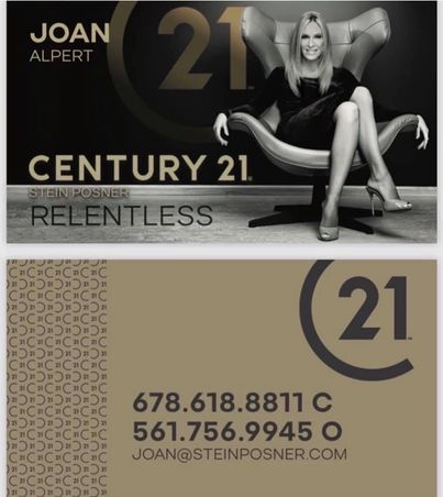
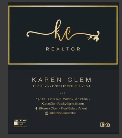
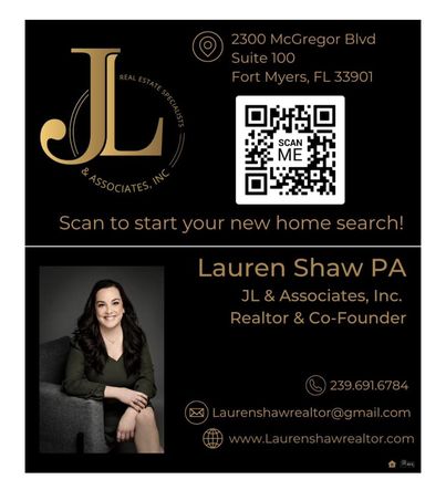
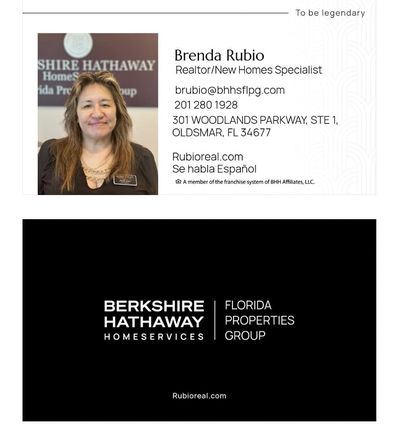
Examples of Luxury Real Estate Business Cards
Let’s first show and later we can tell ok? Here are a few sample of Luxury Realtor’s Business Cards you can review. And here are some samples of both front and back of luxury real estate agents business cards


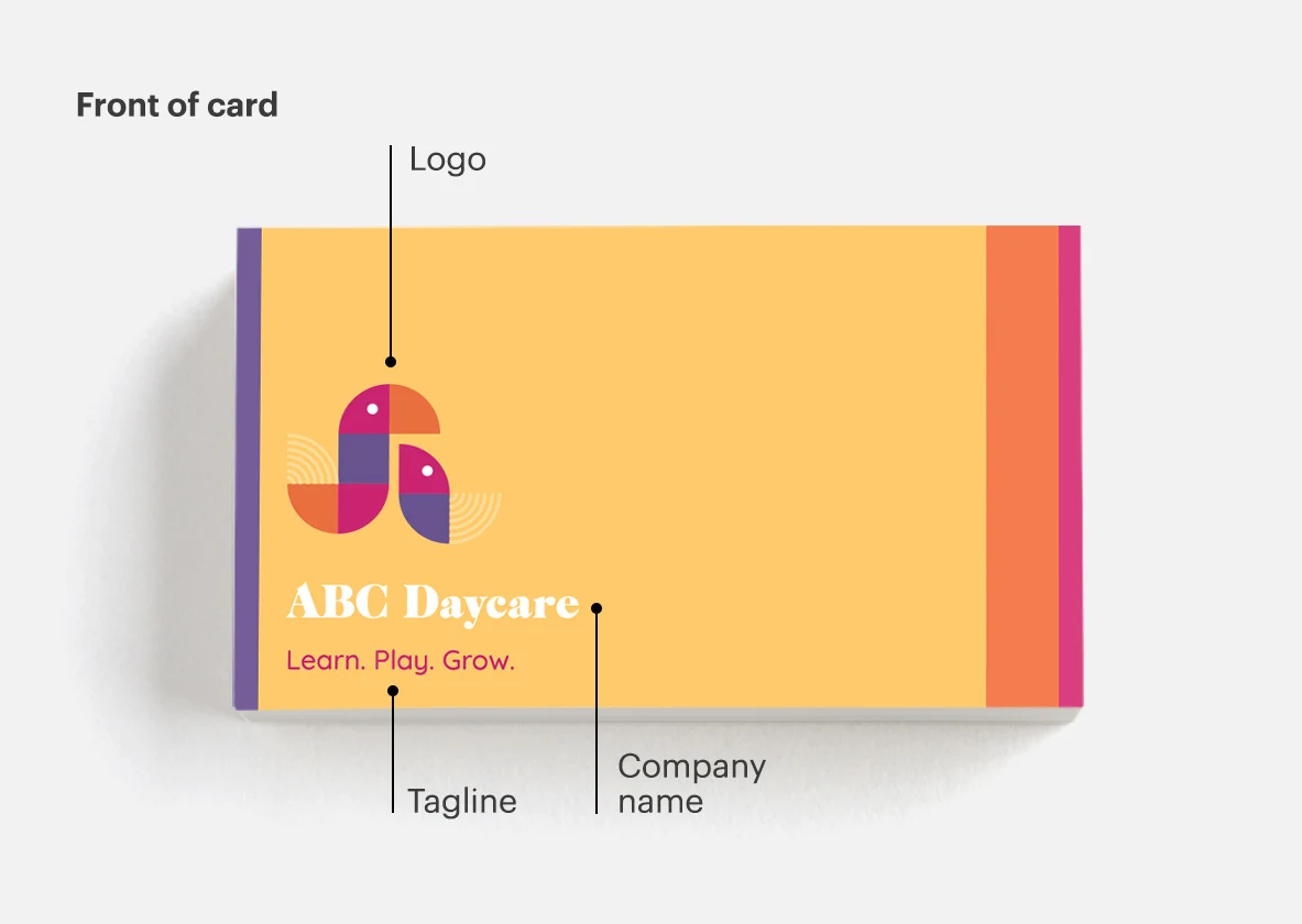
Luxury Real Estate Business Card Information Hierarchy
Thoughtful information hierarchy. Did you ever think such a thing mattered?! “Information hierarchy” is basically design snob speak for organizing the information on your business card in order of importance.
Also a business card’s plays an important role in making your brand memorable. When it comes to luxury real estate business cards, here are the pieces of info you want people to remember for maximum brand impact:
- Your name OR your company/team name
- Your business logo
- Your tagline OR if you don’t have one your title REALTOR will suffice
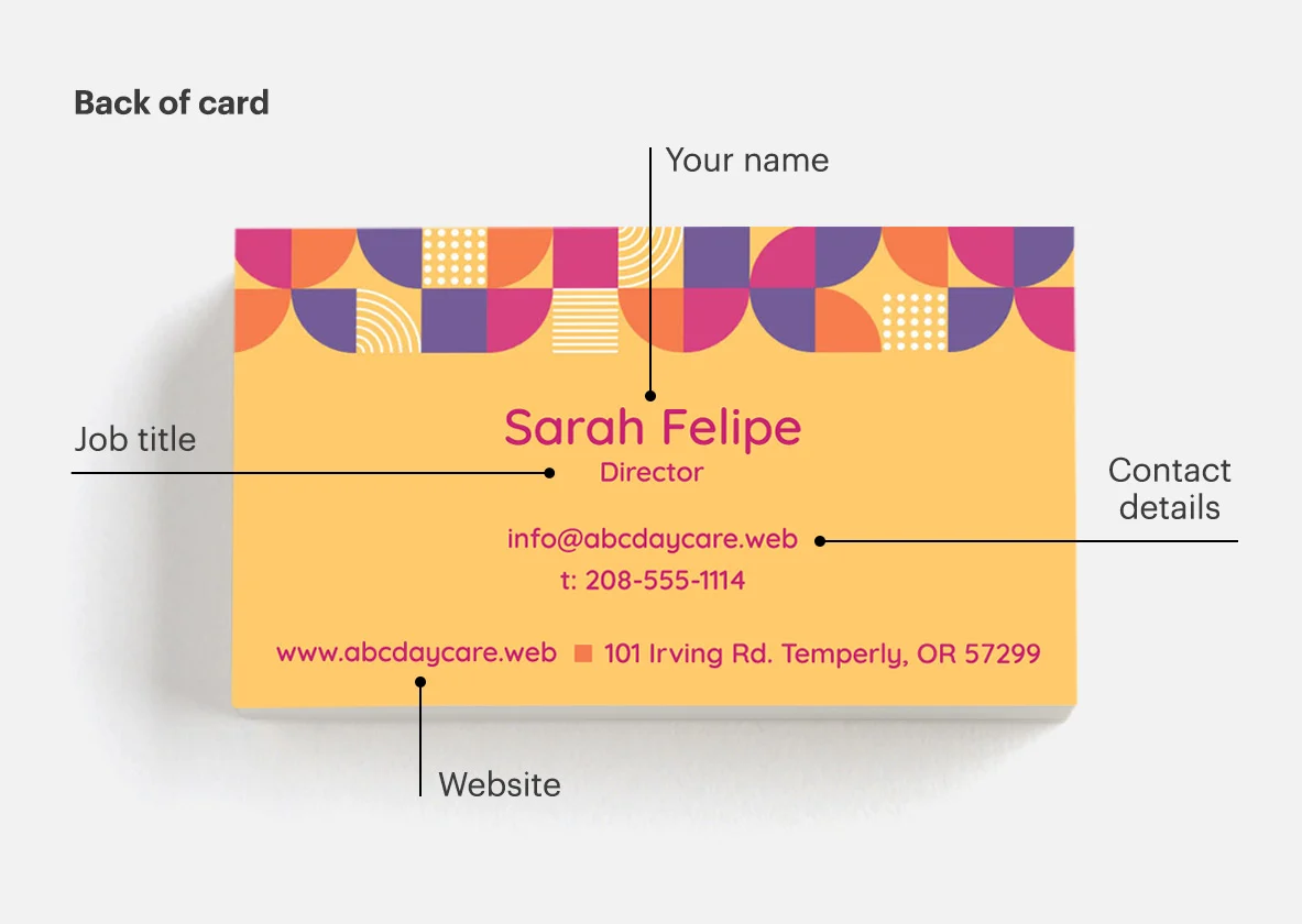
Information hierarchy also helps to distinguish critical information from secondary details to help people quickly find the info they’re looking for given how our eyes tend to scan information.
Here’s the most important info you want people to easily find on your business card:
- Name
- Title
- Contact Info: definitely include phone and email. Including office address and/or website depends on various factors like your layout and whether these pieces of info will be helpful at all for clients/partners.
- Give people a way to learn more about your business like a QR Code or social media handles
Note: part of organizing the essential information is focusing people on what matters. Avoid the need to mention every social media handle you’ve ever created…especially if you’re not active on a particular network OR if a social network isn’t used at all for work purposes. Websites and social media handles are calls-to-actions that basically say “Learn More”. And when it comes to CTAs, less is definitely more!
And information hierarchy doesn’t mean that you need to fit the mold and blend in with every other luxury real estate business card out there. Dare to be different with your designs, but without confusing the message. Business cards often having a short lifespan after you hand them out…and before they get stored in the circular file 🗑. So a unique design can make yours stand out and be memorable.
Now, let your creative genius take the reins! Business cards in the luxury real estate industry don’t need to adhere to a cookie-cutter template. In fact, daring to be different can be what propels your card above the competition. Explore bold typography choices, unique layouts, or exquisite color combinations that reflect your personal style and brand image. Just remember to toe the line between standing out and confusing the recipient. In this case, simplicity and elegance are your trusted sidekicks.
By thoughtfully constructing an engaging information hierarchy on your luxury real estate business card and infusing it with a touch of your creative flair, you’ll craft a powerful representation of your brand that leaves a lasting impression. So, go ahead, let your card become an unforgettable piece of art that opens doors, sparks conversations, and sets you apart in the realm of luxury real estate.
Picking the Right Fonts for Luxury Real Estate Business Cards
So now that we’ve emphasized the importance of design choices, let’s talk about fonts.
To serif or san-serif. That is the question.
Fonts are the stylish backbone of any luxury real estate business card. Fonts, have the power to convey elegance, sophistication, and even a hint of playfulness.
When it comes to font selection, less is more. Stick with two or three fonts to maintain a coherent and visually pleasing design. Too many fonts can quickly become overwhelming and confuse the eye, which is the last thing you want when aiming for a memorable first impression. Here are some font selection tips specific for luxury real estate business cards:
- When you think about the “three font rule” count the fonts used in your logo.
- If you want to go for a super minimal look you can use the same font and just play with a few combinations of weights, capitalization, or italics.
- Helvetica and Futura are classic choices that exude elegance and sophistication
- Fonts like Mohave make a strong statement especially when used with a commanding headline,
- Check out fontjoy.com and fontpair.co. Both are helpful resources that suggest font combinations to ensure your card looks great
While stylish fonts are undoubtedly captivating, readability is paramount. You want potential clients to effortlessly absorb the information on your business card without squinting or playing a guessing game. Opt for fonts that are clear, crisp, and easily legible, even at small sizes.
Find a font that speaks to your personal brand and the image you want to project as a luxury real estate agents but definitely don’t sacrifice readability.
Using Minimalism in Luxury Real Estate Business Cards
Empty space is your friend when it comes to luxury real estate business cards…so guess what that means? Yeap, less is more. Embracing elegance and minimalism can work wonders in creating a card that exudes sophistication and leaves a lasting impression. There’s no coincidence that the same philosophy applies to interior design with luxury real estate. You don’t see many luxury properties where every square foot is crammed with furniture.
By choosing to leave some areas of your business card blank, you create visual breathing room that draws attention to the key details that truly matter – your name, title, and contact information. This intentional use of empty space focuses the recipient’s gaze on the essential information, making it easier for them to quickly digest and remember. Remember, in luxury real estate, it’s all about making a memorable first impression, and sometimes, less is truly more.
Common Design Mistakes to Avoid
Here are the most common business card mistakes agents make:
- using a bad photo: if you don’t have a professional photo, then pick a luxury business card layout that doesn’t require a photo.
- bad photo cropping: If you’re cropping out the bottom your photo, don’t place the photo on top of the layout because you’ll look like you’re wearing a box for a shirt. Pick a layout that accommodates your photo OR use a photo background which will allow you more freedom for placement.
- more than one logo: if you’re going to use your personal or team logo, you don’t need your broker’s logo. If it’s an actual requirement, then design a lockup of the two logos that looks good.
- text that’s too small: if you have so much information to convey, that you must use small fonts, then you’re attempting to convey way too much info.
- too many fonts: We covered it above but it’s distracting.
- too many colors: Even more distracting than using too many fonts.
- including a website url that’s already mentioned in the email address: it’s redundant so it’s a poor use of space
- including icons for social media platforms without a username: Not only is the icon pointless without the username BUT social media platforms update their icons regularly which will make your card feel outdated
- including a “Fax” number: do we need to explain?
Brand Consistency Counts in the Long Run
Your business card isn’t a calling card. In this modern, post-rolodex era, don’t expect people to hang on to your business card for years. And definitely don’t expect that one fateful day, when someone needs to sell their home, they’ll pull out your card and dial you.
Business cards have the lifespan of a fruit fly. When people want to get in touch they’ll google you which means they’ll need to remember you…which brings us back to the real point of the business card in today’s business world.
Your business card is an extension of your brand and it serves as one more opportunity, in a series of marketing touch-points, for your name and brand to get embedded in a potential clients brain.
This is why brand consistency is important. Your business card’s design elements need to be consistent with your broader marketing to make it easier for people to make the visual connection necessary to remember you. These are the design elements you need to consider when it comes to brand consistency:
- Business logo
- Your photo and any other imagery used on the card
- Color palette
- Typography
- Tagline/slogan
So it’s not just about slapping the same logo in the top corner and checking the “on brand” box. It’s about evoking one more visual spark in a series of moments so your name gets further embedded with your target audience. Btw this is where having a brand style guide becomes invaluable. IF you have a style guide, then crafting a luxury real estate business card is probably going to take a fraction of the time.
And just so we’re clear about our fruit fly reference. A business card may have a short stay in someone’s hand or pocket before potentially being discarded. Which is why, your design needs to leave a lasting impression of your brand, even after the card is no longer physically present.
Choosing the Best Card Stock and Finish
When it comes to luxury real estate business cards, settling for the standard or bargain card stock simply won’t cut it. To truly make a memorable impression, opt for high-quality card stock that exudes elegance and refinement.
Investing in quality card stock enhances the tactile experience for anyone who handles your card. The weight and texture of the paper can leave a lasting impression and convey a sense of luxury. Take the time to explore various options by ordering paper samples from major card printers, which are often available for free. This allows you to see and feel the difference between different types of card stock, helping you make an informed decision based on your preferences and brand image.

While quality card stock may come at a premium price, it’s an investment worth making. Remember, your business card is a tangible representation of your brand after a meeting. It should leave a positive, memorable impression on potential clients. By choosing high-quality card stock, you demonstrate your attention to detail and commitment to excellence—qualities that align perfectly with the world of luxury real estate.
In addition to high-quality materials, explore different printing techniques and finishes that exude sophistication and craftsmanship…and give your card a tactile allure that won’t easily fade from memory.
Here are some printing techniques and finishes to make your luxury real estate business card standout:
- Edge Colors: This lesser-known finish adds a touch of your brand’s secondary or accent colors to the card’s edge, making for a subtle yet impactful detail.
- Die Cut Cards: These uniquely shaped cards can be cut into distinctive forms, providing a memorable look, though one must be mindful of space for contact information.
- Foil Stamping: An elegant finish that accentuates specific card elements like logos, offering a premium, shiny appearance at a higher cost.
- Embossing and Debossing: These techniques elevate or recess design elements, respectively, providing a tactile texture without altering the card’s shine.
- Spot UV: This finish highlights specific parts of a card by raising them slightly, making focal points like logos more pronounced and attention-grabbing.
So, take the time to create a card that reflects the luxurious experience clients can expect when working with you. Because in the realm of luxury real estate, where every detail matters, your business card is the gateway to making a lasting impression and opening the doors to success.
In a world where social media followers can matter more than your real estate track record, your business card needs to be more than text on paper. It should command attention and exude luxury. Because let’s face it, standing out is the name of the game in this business…and that goes DOUBLE in the high end real estate market.
So hopefully our tips help you embrace your inner marketing nerd, put on your design hat (or beret if you’re feeling extra fancy) and put together a luxury real estate business card that will capture a prospective clients attention…even if it’s just for a moment so they follow you on IG.
—-
Related Posts
Essential Guide for Real Estate CRM Software

Holding an Open House at a New Construction Home